Welcome to the new and improved Milelion.
We’ve been working very hard to address some of the issues that have existed with the site since day one, with the goal of creating a reading experience that does credit to the content we love to write and share. What you see here is the result of that effort- a leaner, faster, yet richer layout.
Here’s what you can expect:
Refreshed layout and intuitive homepage
The most noticeable change is the adoption of the new Aquene theme, which replaces the old twentyfourteen one.
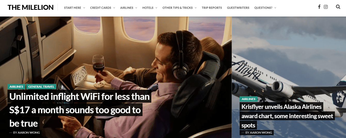
The old twentyfourteen theme displayed the 6 most recent posts as headline boxes, then the next 3 as full posts. That made little sense and led to confusion about which posts were the newest. It also lacked post previews, author or comment information.
The new Aquene theme presents you with information-rich headline boxes that let you decide which articles are worth your time. See a post summary, the authorship, the level of comment activity all without clicking into an article. Interested in a post? Click to read the full story. Want to catch up on the past few posts? Scroll down and tap the load more button. This theme also works great on mobile, and it only loads the posts that you want to read, thus saving your data.
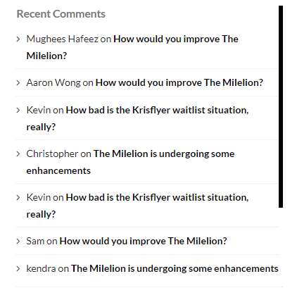
Infinite scroll comments in sidebar
Displaying recent comments on the sidebar was always a challenging issue- display too few and new comments get pushed off the main page too quickly, display too many and the section takes up too much space. But the new comments widget scrolls within itself, loading more comments when you get to the end while occupying the same footprint.
Automatic re-tagging of expired deals
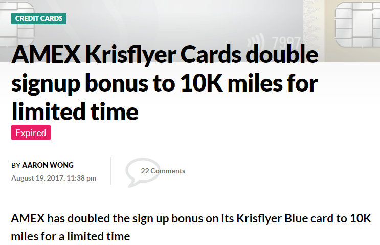
There’s nothing more frustrating to read a post about a great deal, only to discover at the end that it’s expired. True, I could go back and manually add [EXPIRED] tags to deals that are no longer available, but that sounds like work. A new custom plugin allows me to set expiration dates for time-sensitive posts, after which a label will appear in the heading to inform you the deal is gone.
Social sharing
Research has shown that readers of The Milelion are socially well adjusted individuals, and hence must be very eager to share what they learn with real life friends and real life colleagues. A series of integrated sharing buttons is now at the top of each post for easy sharing. Whatsapp, Facebook, Twitter, you name it.
New contact form
Our all new contact form has one important addition- it now lets you upload files of whatever format. Save yourself some back and forth- if you’re writing about a new promotion, a business proposition, an award booking problem, a credit card statement…upload a document and we can get to an answer sooner.
Improved site responsiveness
The old site was getting slower and slower with all the clutter built up plus its habit of loading three posts with every homepage load. We’re now using intelligent caching, image optimization and a new layout to reduce the demand on your bandwidth.
Here’s how the old site was scoring on GTMetrix
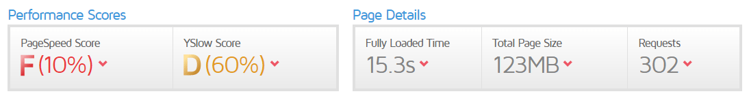
And the new site
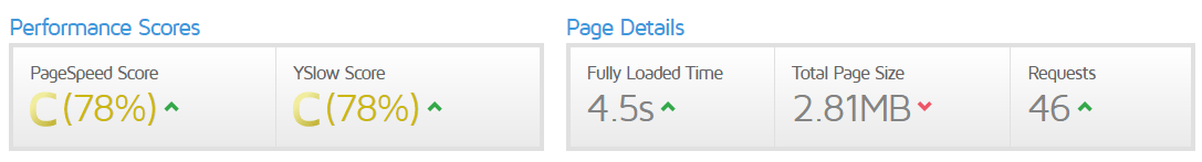
Obviously a “C” rating isn’t ideal, and there are still further optimizations to be done. But we’re determined to get there, and over the next few weeks we should be getting an “A”.
And we’re just getting started…
In the weeks to come we’re starting the next phase of website redevelopment. The following features are on the roadmap
Better visual design for key pages
Some pages have important information but are complete eyesores. Over the next few weeks we’re going to give the following pages a makeover-
- A refreshed Milelion Directory, with an easier-to-use interface that makes searching for past content easier
- A better guestwriter portal complete with bios and easy links to past articles, as well as an opportunity for one-time submissions
- A revamped credit card guide that will list out your options for different categories of spend
- A new and improved trip reports index that will make reading and looking for reviews of specific products much simpler
Enhanced comment system
A new comments system is on the way that will allow you to reply to comments as easily as you would an email. It was hoped that this could be part of today’s launch but conflicts on the backend means this needs to be pushed further down the road.
Known Issues
We lost the email subscriber list in the move over and are trying to restore it asap. If you’d like you can resubscribe to the site’s posts on the sidebar, but otherwise we’re talking to WordPress Support to see how we can fix this (Update: fixed!)
Here’s how you can help
As with every website overhaul, there are bound to be teething issues here and there. We’ve tried to catch as many of them before the launch, but if you come across any more please write in or leave a comment. If there are any further features you’d like to have in the next phase, I’d love to hear them too.
So this is The Milelion v2.0. Enjoy your stay.


Wow!! I like the new layout!!
glad you do! we’re working out some kinks still, but feel free to poke around and see what’s what.
Did you also update your profile pic to that with the SQ girls ?
i’m magnetic that way.
First! Oh no..not first already =(
ha, wait for milelion 3.0
I can’t even. Awesome update!
glad you like it! have fun poking around.
AHHH. sorry. a bit of OCD.
I realised your 2nd row of preview, the preview picture is a round shape. Third row onward, preview picture is rectangular. Theme layout?
Not a bit concern but it would be nice to have consistency for aesthetics purpose.
Thanks!
sorry, missed this. that’s more a feature than a bug…but you’re not the first one to point it out. you don’t think aesthetically it’s nice to have a break between rectangle and rectangle with some roundness?
Yes, if your preview circle is big as the rectangular boxes below it.
For now, no. it is too small, being dwarfed by the articles on top and below. This just means that there is a chance that three articles will be missed totally for people who skim through the page.
ok will explore what i can do about this
Very nice, Aaron! 🙂
Very clean and neat economy colours. Any plans to dress it up in SQ Suite/First Class colours? 😉
actually i’m very fond of the gold shade they use on suites boarding passes….
Nice! Thanks for the update!
Hey Aaron,
I just wanted to say that I think the way you’re arranging posts doesn’t seem very intuitive to me. Here’s what I see: https://imgur.com/a/dvpXV
Why is post (2) sliced in half? Why do posts (3), (4), and (5) get such little space while posts (6) and (7) get more? Surely newer posts get more screen space?
Hey Wilson thanks for the feedback. The idea behind the theme is to do a rule of thirds with the top two posts. One featured more prominently for 2/3 and the second for 1/3. The problem of slicing has more to do with the featured image chosen, which is something that needs to be given some thought. 3-5 were programmed in the theme as circles I presume to give some variety as opposed to 6 and 7 onwards which will be boxes. These are design choices by whoever made the theme. But if you take the view of reading top… Read more »
Hey Aaron, I understand the ideas behind the theme — I just think that it’s not the best-executed theme. (But who am I to criticise? I’m no art/design major nor do I have professional expertise in this field.) What was most disconcerting to me was the 2nd post, where the picture was cropped. It seemed like it was either (a) part of a horizontal scroll feature; or (b) less relevant content (since the ancillary content is in the right third below, with the main content on the left and middle). Now that I understand the design, I will pay attention… Read more »
Just want to pipe in – I wouldn’t think that the way the 2nd article appears is strange, if everything below looked of the same size? But no. 3 , 4 and 5 are definitely strange to me because they’re so small. I actually thought the article titles were quotes! Like you know how they get blurbs on the back of a book that say Best Site Ever! – By Aaron Wong
good job aaron, always a pleasure reading
Thank you! Hope you continue to find the stuff we do here useful
Did you move from wordpress.com to self-hosted WordPress?
Nope, was always self hosted. Changed the theme
Any reason why there is a captcha for making comments? Haha. On mobile I’ve got to do it over and over.
By right you shouldn’t see it after the first time because your browser remembers who you are. But give me a while and I will disable it. My antispam should be able to cope without captcha
Testing
I’m still have to fill out the field though :/ even for this comment. wonder if any other readers can confirm? I’m on chrome Version 61.0.3163.100 (Official Build) (64-bit). If it helps.
ok fixed it. the captcha doesn’t show if you’re a logged in user fyi. i will need to monitor this over the next few days- if there’s a lot of spam comments getting through i’ll need to re-enable it.
Perfect, its great now. Just a thought- Is there a report spam feature? Let the crowd do the work for you.
Don’t know if anyone’s mentioned to you but your drop down menus from the top are being obscured by the photos from the newest posts. The main menu at the top is visible (Start Here, Credit Cards, Airlines, etc), but when I mouse over them, the options in the drop down menu cannot be seen.
hey man, I don’t see the problem you’re encountering. any chance you could show me a screenshot? for what it’s worth, here’s what i’m seeing.
 ?dl=0
?dl=0
 ?dl=0
?dl=0