I remember Milelion 1.0.
It was April 2015, and in the midst of an existential crisis at work, I decided to start a website (as one does). I didn’t know the first thing about hosting or web development, so I signed up for the cheapest plan I could find and slapped on Twenty Fourteen, one of WordPress’ default templates.
A few mouse clicks later, I was now the proud owner of Milelion.com (other contenders: travelhacksg.com, milehacking.net, and the probably-best-I-didn’t-use-it aaronsadultadventures.com)
Running a dot com startup will look really good on my CV, I told myself as I paid the $12.95 registration fee.
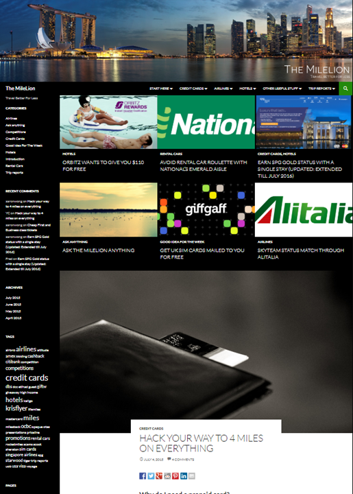
Milelion 1.0 was…basic. It wasn’t built to be a looker, it was built to get the job done. There was hardly any functionality to speak of (no widgets, no tables), the formatting looked bad and I often wondered how many UX laws I was violating, but it worked well enough for the first couple of years.
Then the site started growing. An iffy product launch here, some influencer drama there, and by the time late 2017 rolled around, readership had increased to about 40,000 people a month. The site was creaking under the strain, and it was time for an upgrade.
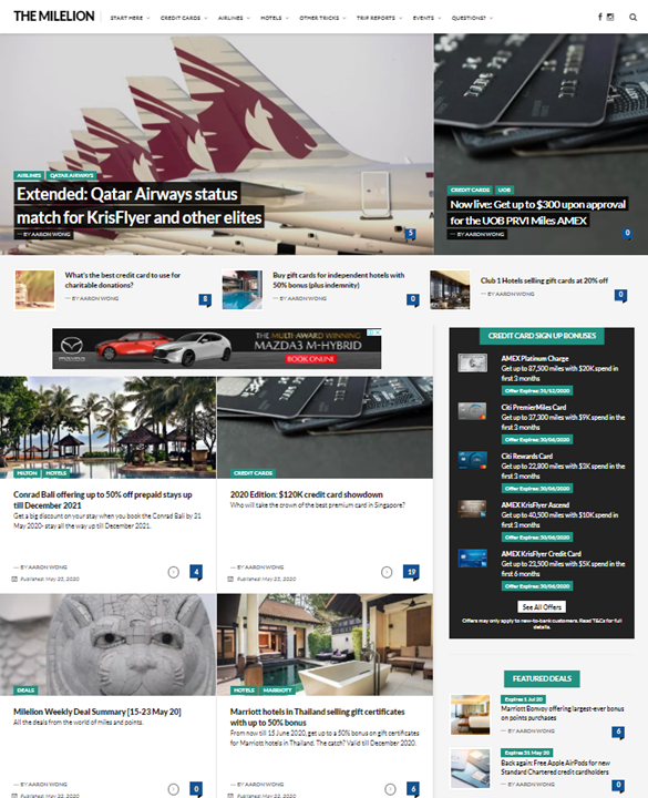
So in October 2017, Milelion 2.0 was launched. This introduced the Aquene theme, and with it a host of performance and functionality improvements like post previews, author cards, and social sharing. The home page was also revamped to for a better reading experience, and on the whole, a much more pleasing aesthetic.
Aquene has been a great platform, but the site’s slowing down, and the design is no longer unique. Moreover, with readership at well over 100,000 per month now, I’d say it’s time for the next step forward.
Here’s what you can expect from Milelion 3.0.
A new layout
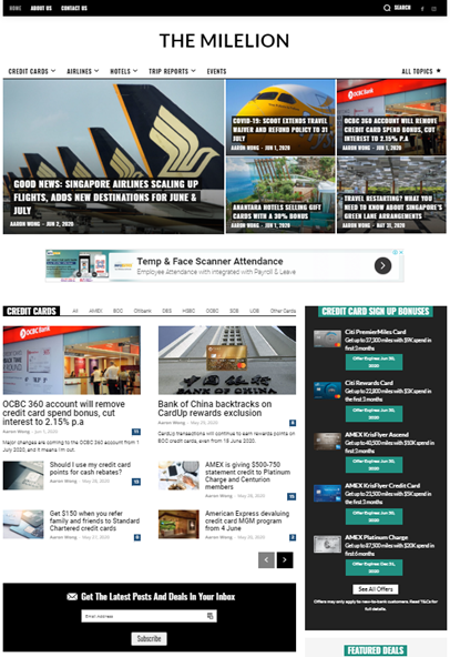
When deciding on a new template, the goal was to make the transition as seamless as possible- keeping familiar elements, while adding subtle quality of life improvements like easier navigation.
The first thing you’ll notice is the revamped home page. With Milelion 2.0, all posts were laid out in chronological order. That was fine if you wanted a running list of all the developments in the miles and points game, but didn’t work so great if you wanted to drill down on a particular topic like credit cards or airlines.
The new layout observes chronology, but adds categories into the mix. The five latest posts, regardless of category, will always be at the top of the page. Subsequent posts will be grouped into Credit Cards, Airlines, or Hotels.

If you want to read about just a particular bank or airline, simply click on one of the options in the tab, and all the relevant articles will be filtered for you.
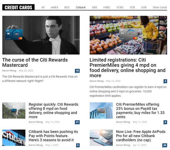
Alternatively, you can visit one of the sub-category pages using the menu on the top right.
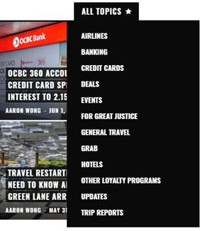
All other topics are covered in the All Stories section, where posts are displayed in chronological order.

A dedicated section for Trip Reports
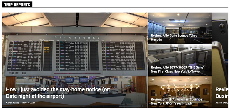
Let’s face it. No one earns credit card points as an end in itself. The payoff all comes when you cash them in for that amazing airline or hotel experience.
That’s why we love to read trip reports, and to give the airline and hotel reviews more love, I’m going to curate a separate section just for them. You know, so we can daydream about travelling again…
A refreshed credit card sign-up page

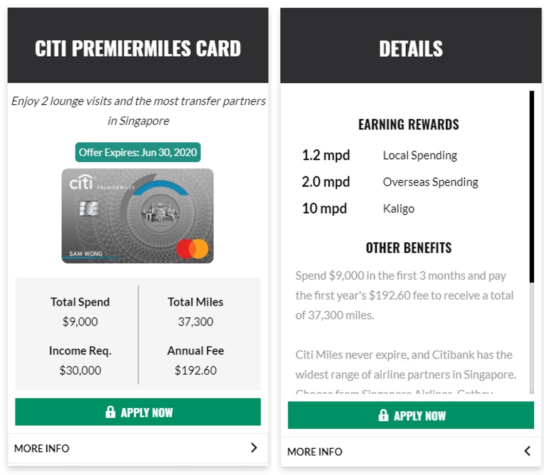
The credit card sign-up bonus page has been revamped to offer information in series of easy-to-read panels.
The front side shows snapshot information: how much spending yields how many miles, the card’s income requirement and annual fee.
Tap on “More Info”, and it flips over to show information about earn rates and key benefits.
Faster loading times & greater stability
Milelion 3.0 should load faster than any previous version before, whether you’re reading on mobile or desktop. There are still a few more speed tweaks we’ll be making in the days ahead, so it’ll only get better from here on out.
How you can help
As much as we’ve made every effort to test the site and look out for bugs, there’s bound to be something that slipped through the cracks.
If you spot anything amiss (weird formatting, non-functional buttons, missing images, ads appearing in awkward places or consecutively), please do report it via this link. Alternatively, you can reach out via Telegram too. I’m currently aware of a few tables that don’t fit properly, and some comments that were lost in the migration, and am working to resolve that.
Also, if there’s any feature you’d like to see, be sure to shout out too. The Milelion, after all, is meant to be a happy place to visit.
So welcome to the new Milelion. Enjoy your stay!







Nicely done. Like it a lot.
hmmmm aaronsadultadventures.com would have been awesome though. Nothing like reading adult adventures to past my time
i assure you all of my adventures at PG-13 at worst.
PG-13 than no so fun Liao leh
I see you start young
#UnexpectedHanson
As you move from strength to strength, good luck to you and 3.0!
Under social media links, maybe worth adding the link to YouTube as well?
I second the other comment.. aaronsadultadventures.com would have been awesome, and.. erm.. a mouthful 😀
haha maybe milelion 4.0 can look at that
Maybe worth adding the comments counter to the first panel of articles as well? Sometimes, we revisit articles during the day to check activity in comments section / respond to them. Advantage of the counter is it allows to directly go to the comments section, without having to first open the article and manually scroll down.
i wanted to, but couldn’t. coders tell me the theme doesn’t allow for that.
Looking great!
Congrats on the new website!
thank you! a lot more fixes to do, but we’re getting there.
Where is the product launch video that usually accompanies such stuff ala Apple WWDC?! Aaron in turtleneck *_*
Well done Aaron. Seems like this new site is still based on WordPress platform? The page aesthetics similar to TPG site. 😛 But overall the look and navigation flow is good.
Sorry should be Omaat, not TPG. 😛
Love you Aaron!
Great layout, some frequently used info like the seat guide are now easily available from the top menu bar. Thanks for aways providing the public with the highest standards miles guide
My first impression: Very sleek. Nice.
Congrats on v3.0.
I only started reading Milelion in 2018 but def have not seen ML1.0 before
Hi Aaron, right at the bottom of the site ‘All Stories’ shows Jun 1, 2020 as the latest article but that’s not true right as you have articles posted on 2, 3 Jun. Thanks.
this shows all stories after the 5 on top- so the 6th post onwards.
Seriously dude, WHY ARE THE TITLES IN ALL CAPS?!
Feels like you’re hollering at everyone (not just the cashback loving masses). 🤣
you’re not the first one to say that, actually. seems like all caps gets no love. i’m working on fixing it- check out the first 5 posts on the homepage now.
MUCH better!! 👍🏼
Easier to read the titles now after CAPS removed
Hi Aaron
Great new site!
On the Credit Card Sign Up Page, please could you add whether the annual fee is waived for the first year or not please? That is a big decision for many whether to sign up for the card.
Jenny
that’s done, thanks!